Shop News
Tariffs next week?
Here's the Short Version: If you live in the USA and place an order this week, there’s a chance you may have to pay a 25% tariff to receive your...
Tariffs next week?
Here's the Short Version: If you live in the USA and place an order this week, there’s a chance you may have to pay a 25% tariff to receive your...
Tariffs
Update: they have just announced a "pause" in tariffs for 30 days. Let's hope this pause is permanent. On February 1, Donald Trump signed an executive order imposing 25% tariffs on...
Tariffs
Update: they have just announced a "pause" in tariffs for 30 days. Let's hope this pause is permanent. On February 1, Donald Trump signed an executive order imposing 25% tariffs on...
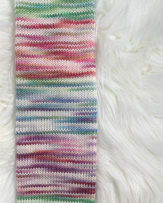
Introducing Trifecta!
Trifeca is our newest yarn, named for its balance between softness, durability, and versatility. It's a 3-ply, heavy fingering weight with a blend of 80% superwash Merino and 20% extra soft nylon.
Introducing Trifecta!
Trifeca is our newest yarn, named for its balance between softness, durability, and versatility. It's a 3-ply, heavy fingering weight with a blend of 80% superwash Merino and 20% extra soft nylon.
Fall Preview
The shop will be quiet for the next couple weeks as I prepare for Knit City, but there’s a lot coming up soon! Instagram Live with Andrea Rangel In...
Fall Preview
The shop will be quiet for the next couple weeks as I prepare for Knit City, but there’s a lot coming up soon! Instagram Live with Andrea Rangel In...
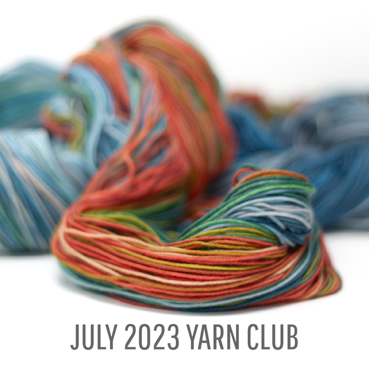
Join us for some Octopus Socks in July!
Signups are open now for the July shipment of our yarn + pattern club with Andrea Rangel. This month’s project was inspired by the colours, textures, and habitat of the...
Join us for some Octopus Socks in July!
Signups are open now for the July shipment of our yarn + pattern club with Andrea Rangel. This month’s project was inspired by the colours, textures, and habitat of the...
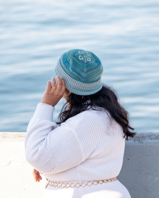
June Club Reveal
It’s time to share our June club project! This month’s pattern and yarn were inspired by the eerily beautiful moon jellies we have in the waters off the West Coast. A ribbed...
June Club Reveal
It’s time to share our June club project! This month’s pattern and yarn were inspired by the eerily beautiful moon jellies we have in the waters off the West Coast. A ribbed...